The office of one of the oldest residents of Olivia Centre has undergone a metamorphosis. Adapted to the latest trends, the
Bayer Group’s
office was created in the spirit of less waste and is based on a new workspace strategy applicable throughout the group. Design Anatomy
, whose portfolio includes over 200,000 euros, is responsible for the project. m.kw. designed and finished office spaces. Bayer has recently celebrated its tenth anniversary at the Olivia Centre. It’s one of the longest-standing companies here, so it’s time to completely change the interiors in line with current trends.
“Our common goal was to adapt the premises to the changing needs and expectations of our employees ,” says Anna Branicka, lead architect at Design Anatomy. – The project was implemented as part of Bayer’s Next Normal Office Concept. Based on it, we have introduced numerous changes in the functionality of the office, maintaining the existing layout of walls and ceilings. It was important to us that the implementation was carried out in the spirit of less waste, thanks to which we were able to optimize the costs of modernization.
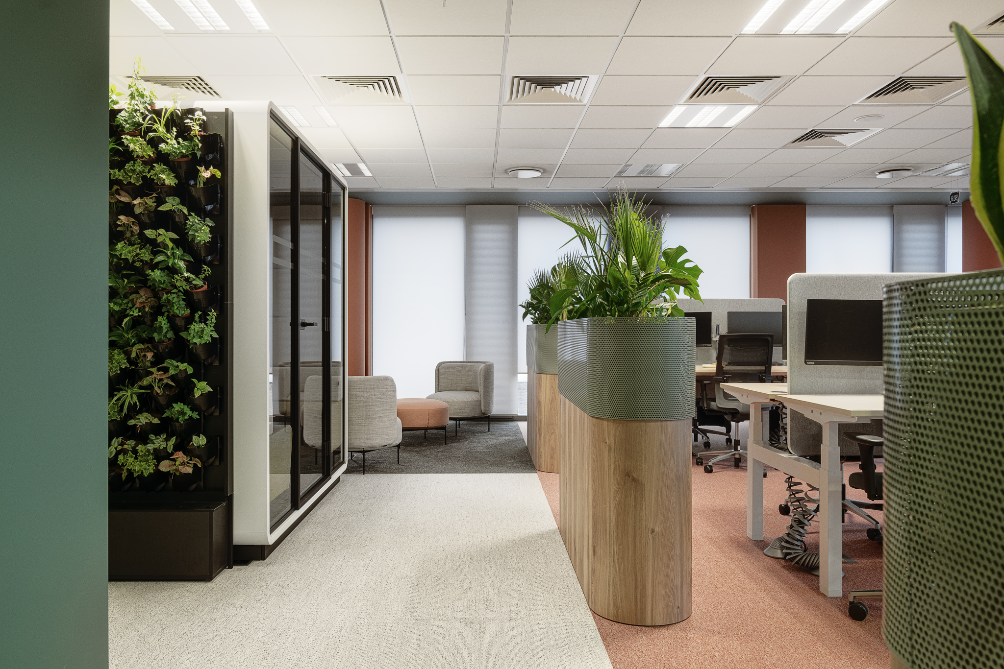
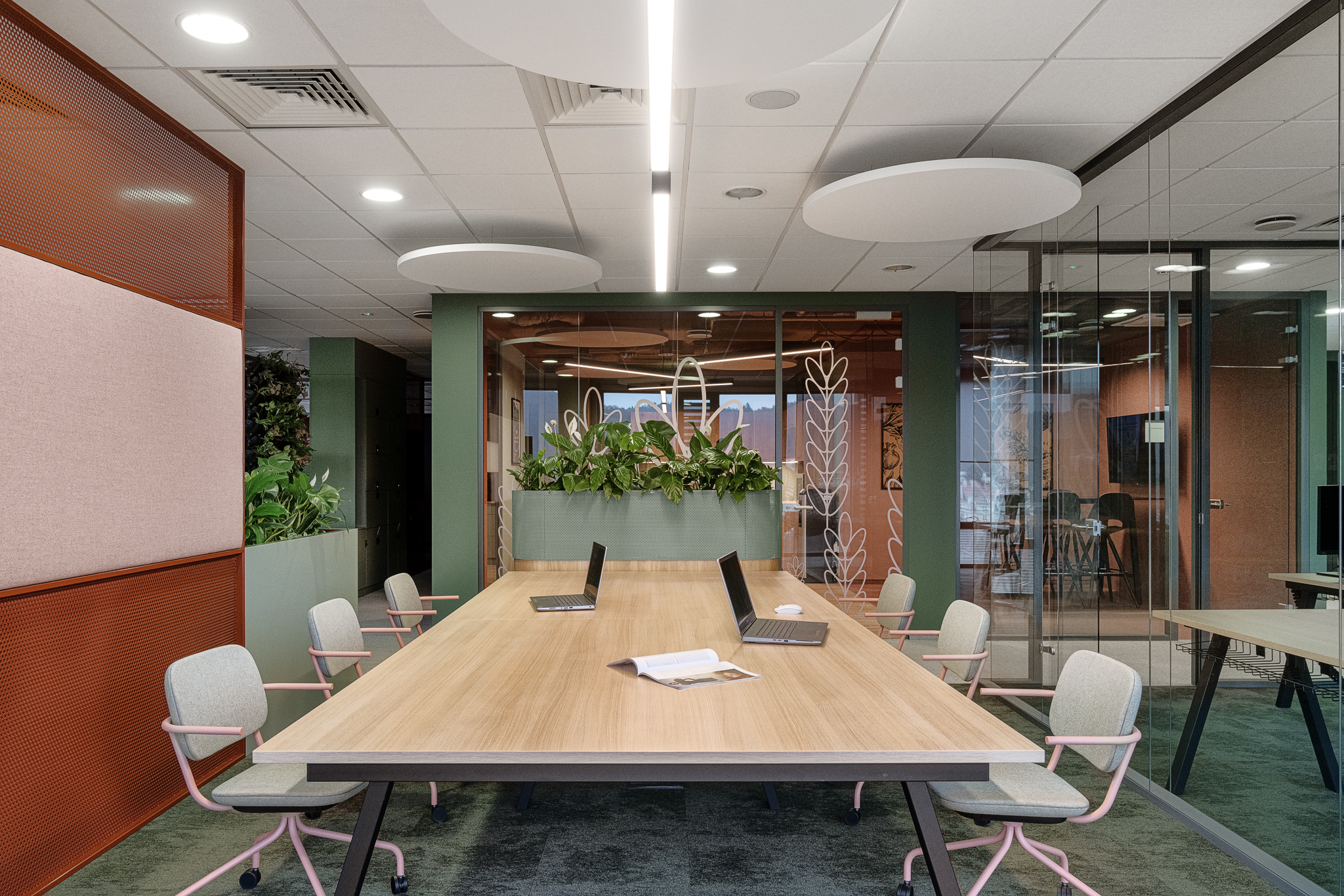
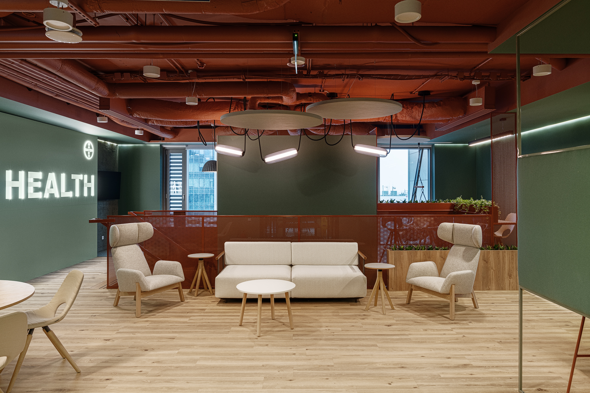
The open space has been divided into smaller, more intimate zones, which is conducive to effective communication and cooperation between employees. Private offices have been redesigned in favor of more flexible and accessible spaces that are conducive to various forms of work and relaxation. The newly designed spaces include quiet work rooms, relax rooms providing a place to relax and recharge batteries, and snooze rooms allowing employees to take a short nap during the day. All this to improve the comfort of work, concentration and productivity of employees.
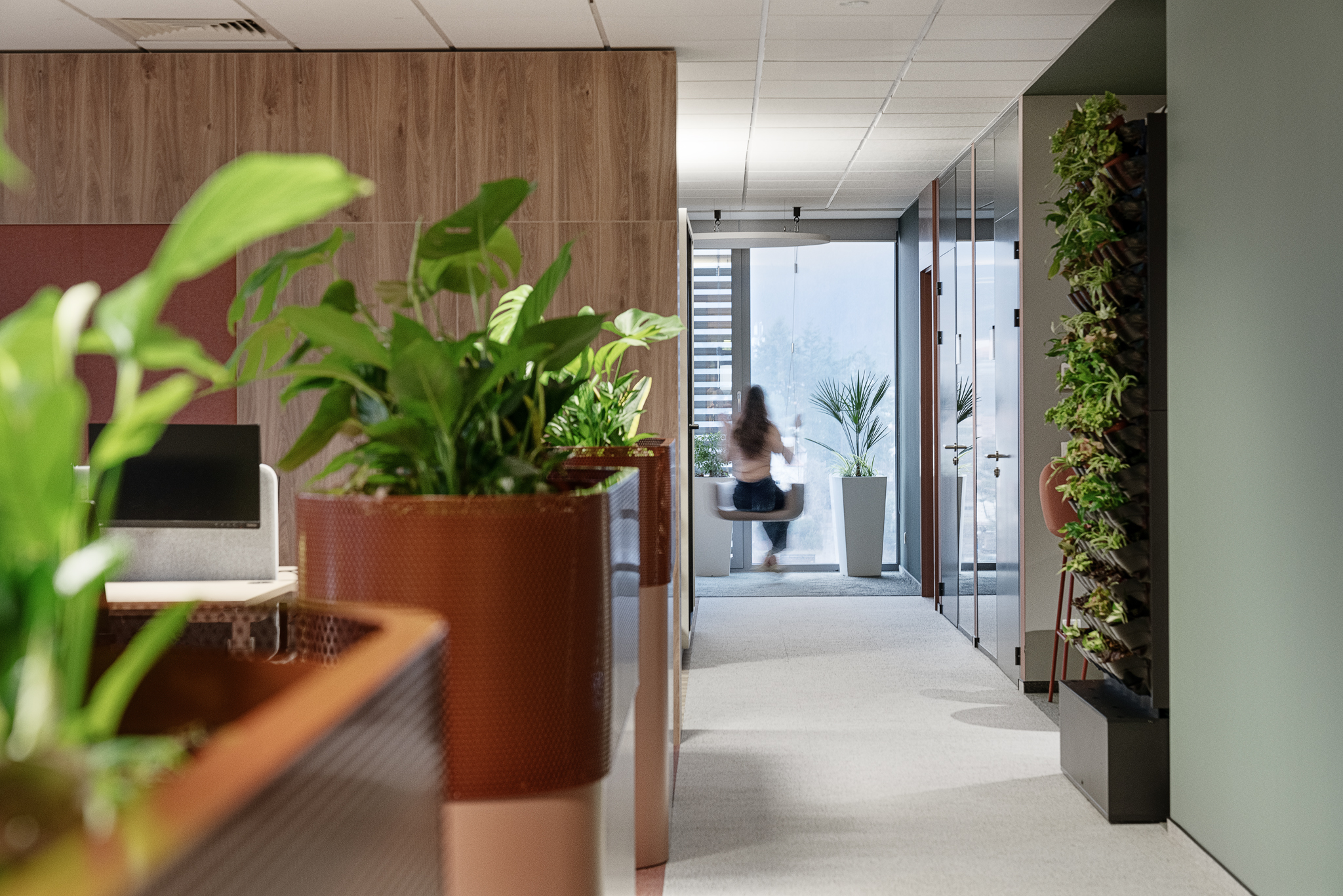
At the same time, the offices have gained a completely new style. The main theme of the project are references to Oliwa, the historic district of Gdańsk where the Olivia Centre is located. A range of warm reds and greens refers to the surrounding landscape. We made sure that there were a lot of plants in specially designed pots and even in the walls of acoustic booths – says Barbara Wasilewska, architect at Design Anatomy. – We have introduced many solutions to improve the comfort of work: wall panels and openwork partitions, separating individual work zones, carpets with high acoustic parameters. The restaurant has become more flexible and user-friendly. We are glad that we were able to be part of the process of change taking place, which reflects the business dynamics and the beauty of the world around us. It was a great challenge for us.
“Bayer’s new office not only implements new trends, but has also become an exemplary solution that arouses great interest among other tenants of our centre ,” says Maciej Kotarski from Olivia Centre. – On a regular basis, during sales talks, we visit this office, showing how creative and designer a modernly designed office space can look. It arouses universal admiration and is often a contribution to putting conversations on a new track.
Fig. Tomasz Kurek | ©Tom


