Over the past year, the Gdańsk Foundation for Management Development has undergone a process of numerous changes, including the introduction of new and modernized training and consulting products to its offer, technological development and improved internal processes. Their element is a refreshed external image – a comprehensive reconstruction of the visual identity, from the new logo to the GFKM website.
A mirror of change
The adoption of the new visual identity is primarily due to the dynamic development that has characterized the last year at GFKM. We are constantly innovating training, products, MBA programs and internal processes to best meet the expectations of our customers. In this way, the visual line became a mirror of the changes in GFKM.
Andrzej Popadiuk, President of the Management Board of GFKM
 Dynamic perspective – your perspective!
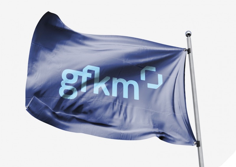
The new color scheme of the logo refers to the colors originally used. However, it has been refreshed, based on one dominant color, giving it elegance and stability. Navy blue and blue in the basic palette of the brand’s identity give it freshness and modernity. On the other hand, the two buckles that make up the logo signet give it a dynamic character and introduce the concept of flexibility of perspective: they can expand or focus, as the lens does. The projects were supervised by Engram.
The new GFKM brand language reflects the current nature of the organization and its aspirations. In the course of the work, a communicative idea was developed to expand the perspective on business challenges. We know that the GFKM brand helps its customers to look at themselves and their organizations in a full and valuable way. Replacing a fragmented view with a broad approach is the essence of the services offered by GFKM and its updated one. In addition, the new branding is embedded in contemporary communication trends. It is characterized by clarity, dynamics and great consistency – starting from the logo, through icons, photos, and ending with the way layouts are built. Importantly, in the case of a brand with 25 years of experience, the current image is a natural continuation of GFKM’s previous identity.
Bartosz Kotowicz, Managing Director of Engram Branding Agency
Fast, intuitive and mobile
Not only the elements of visual identification, such as the logo or promotional materials, but also the website have changed. The new version of the website is faster and lighter. It has been designed to be more convenient to use both in a desktop browser and on a smartphone or tablet.
By focusing on a fast and aesthetic presentation of information on all platforms, we have taken care of a positive experience for visitors to the GFKM website. Together with Matsuu, the contractor of the website, we will look for further ways to improve and streamline the website so that the GFKM website is even more convenient for users and provides the information they are looking for in an intuitive way.


